

Desafino
Brand & Illustration
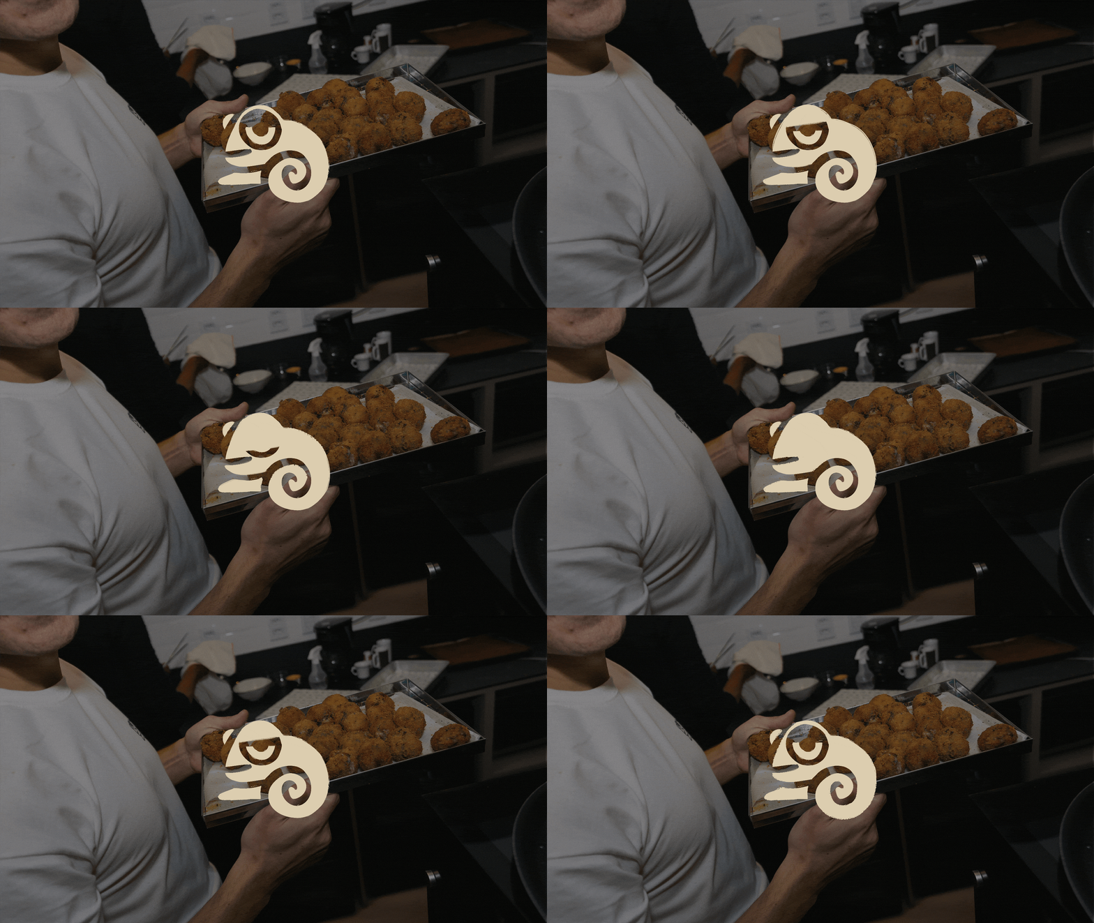
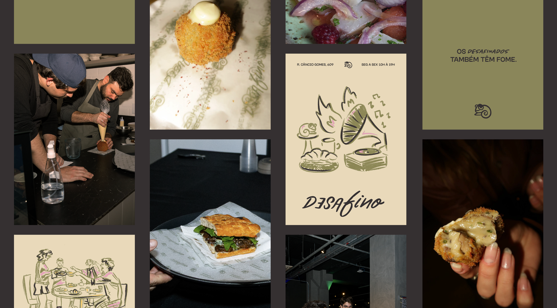
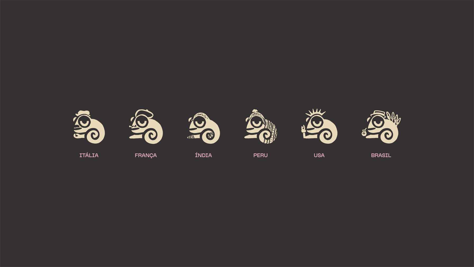
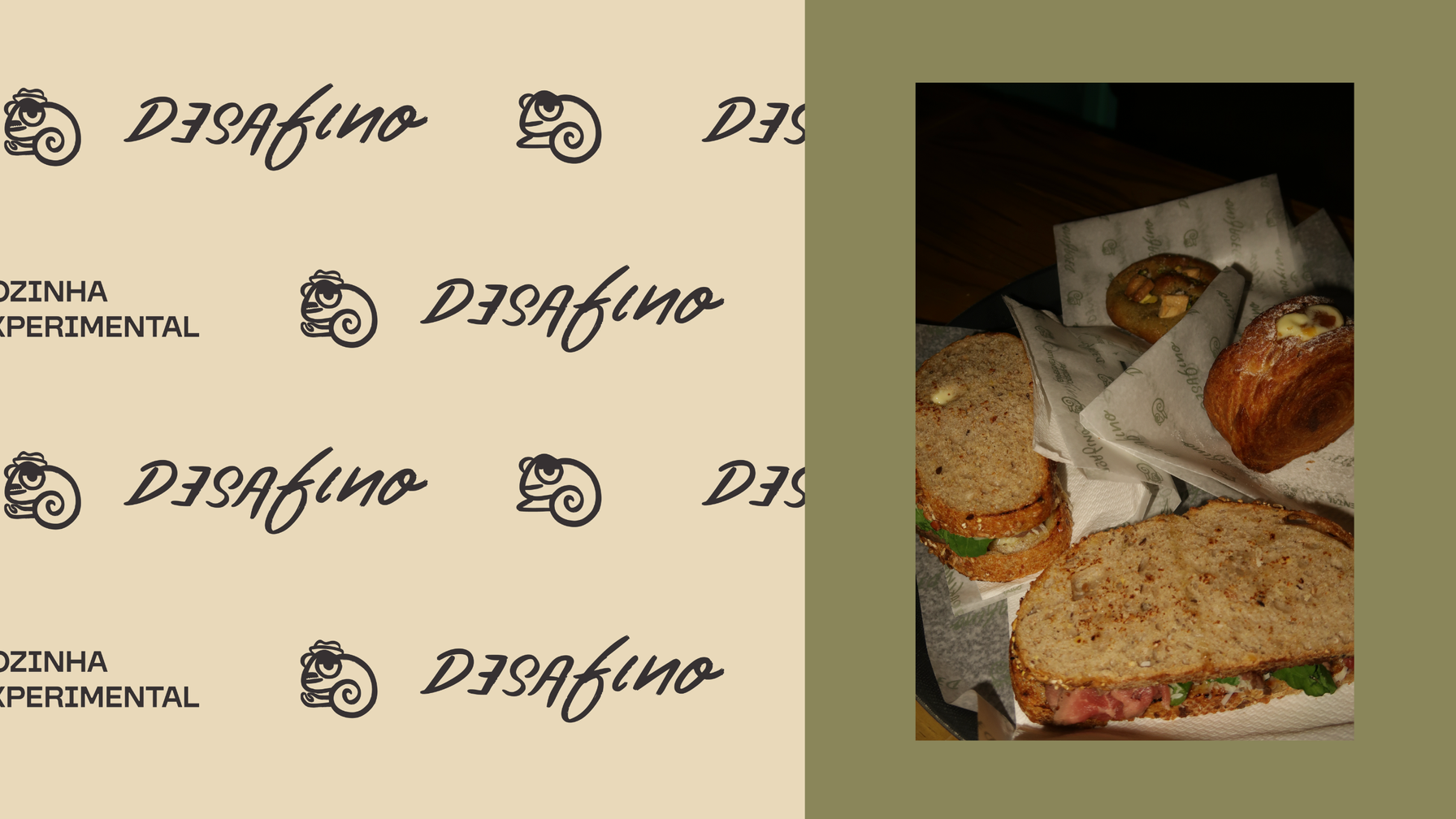
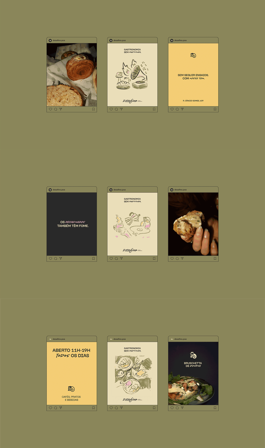
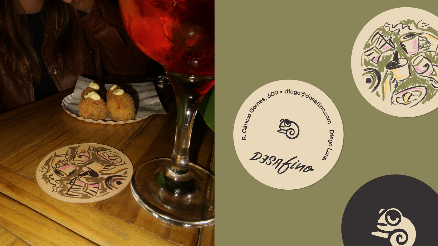
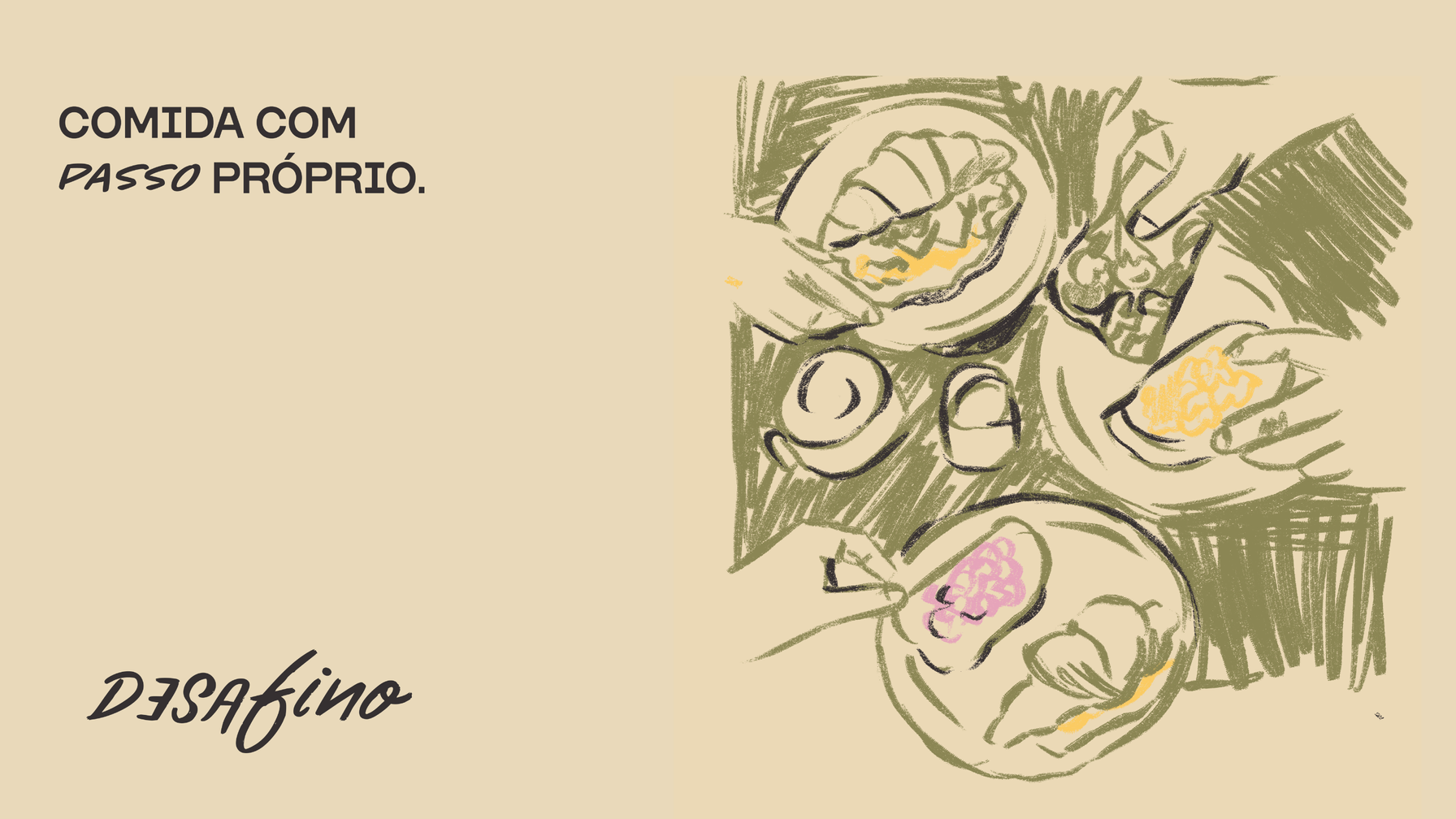
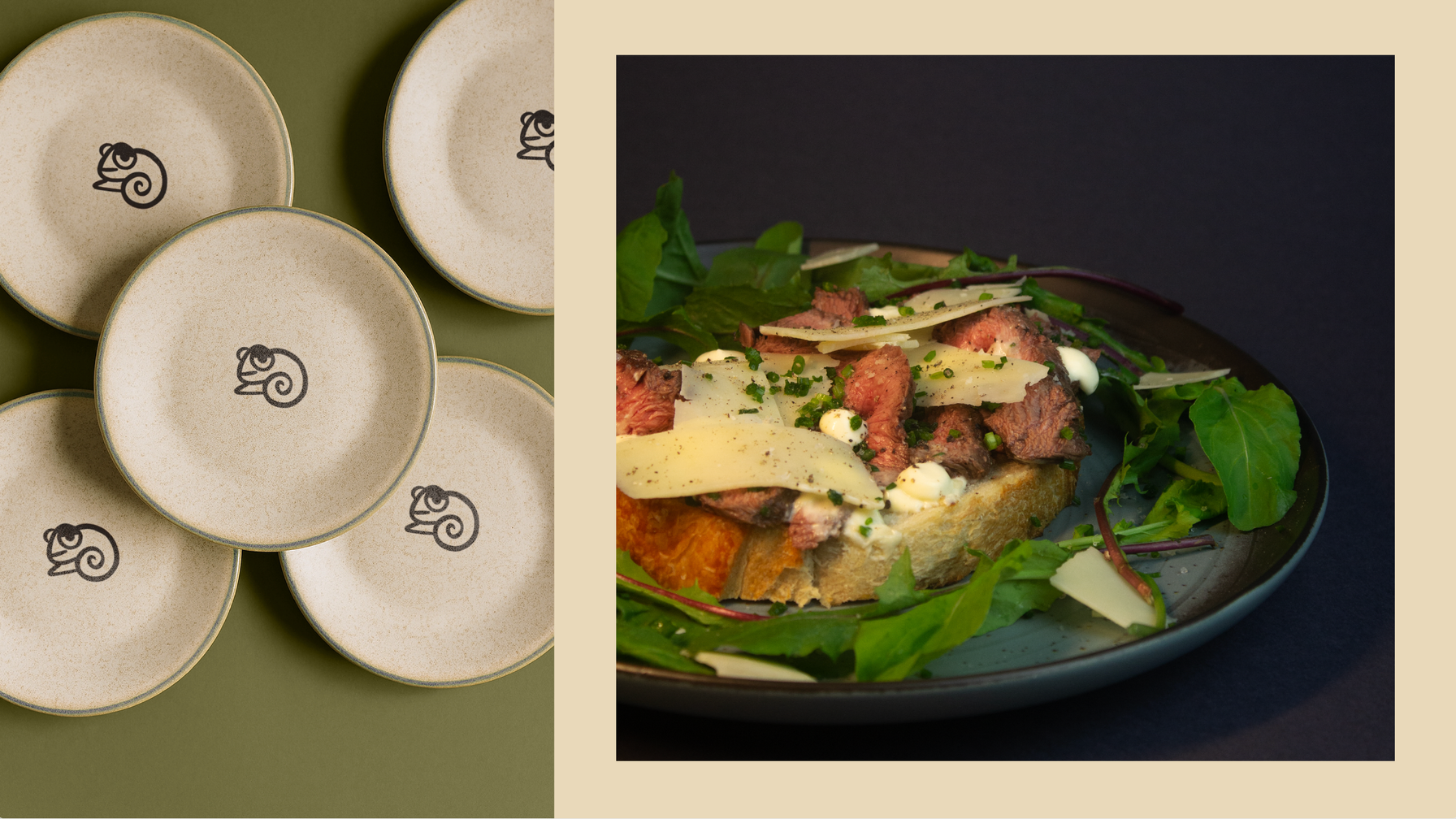
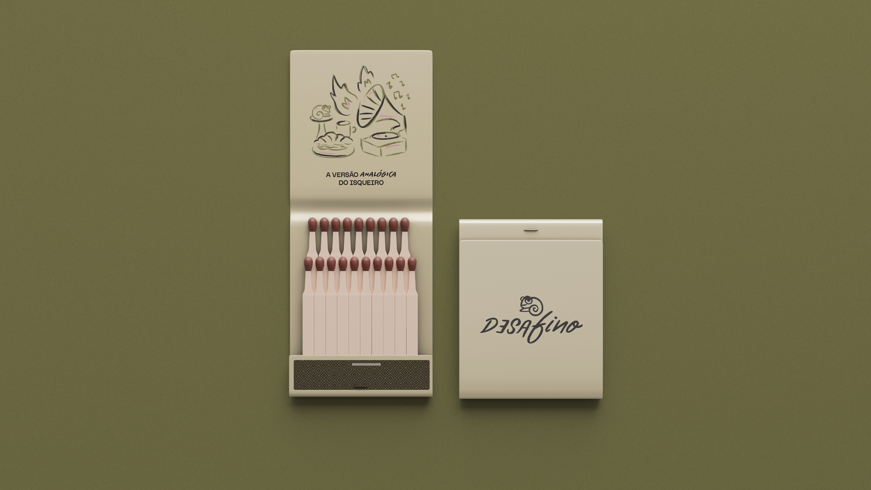
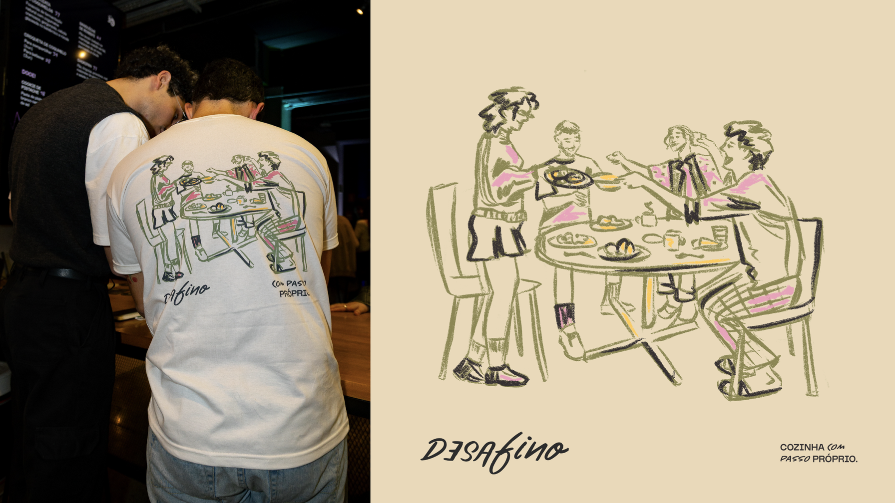
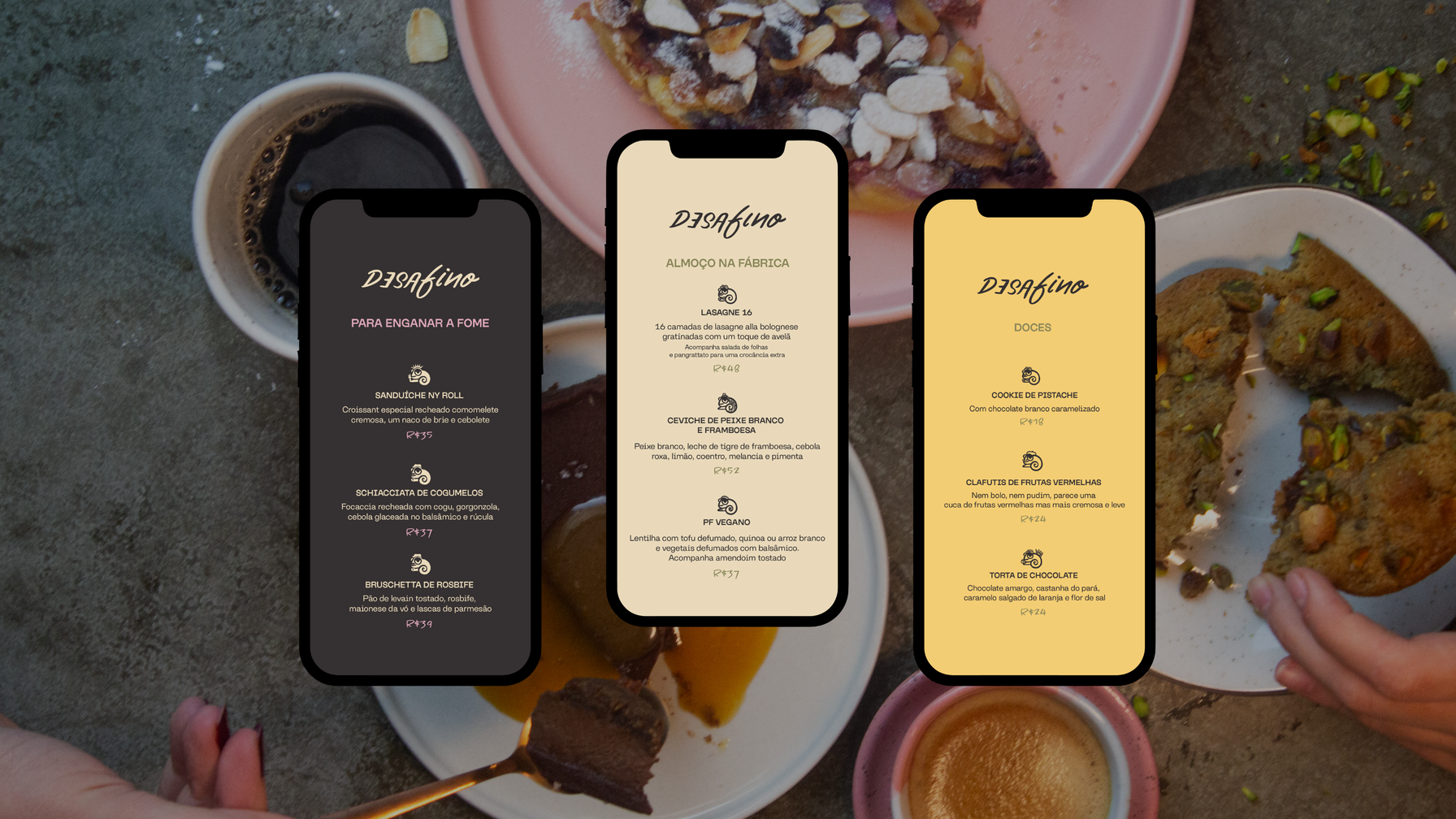
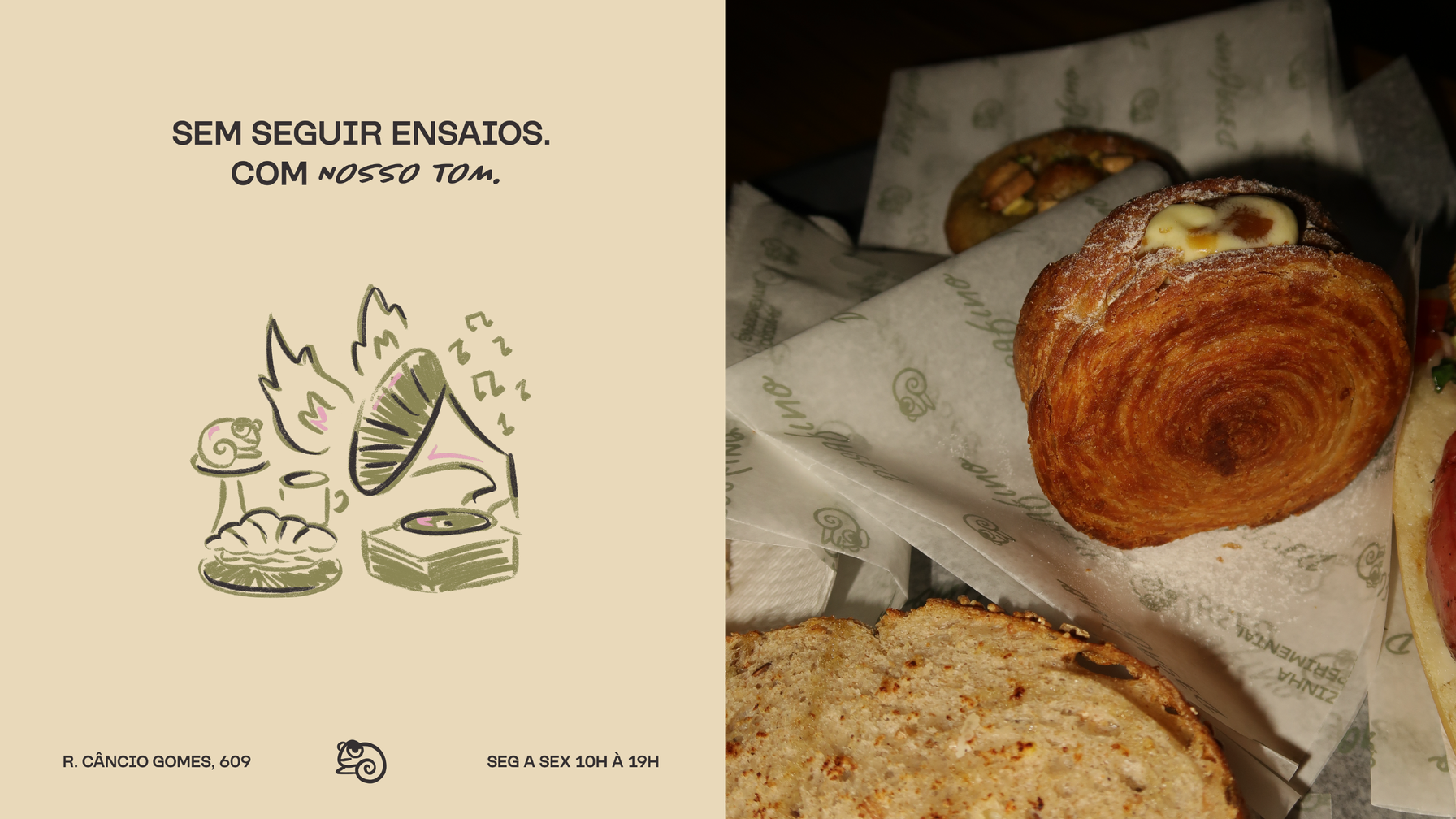
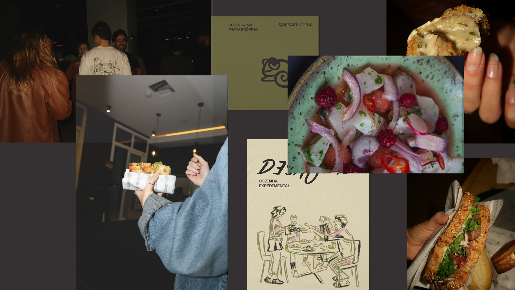
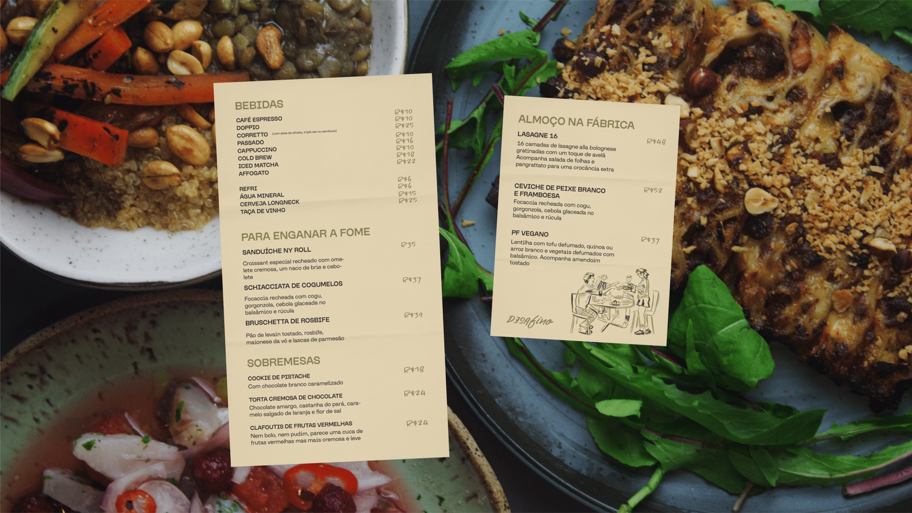
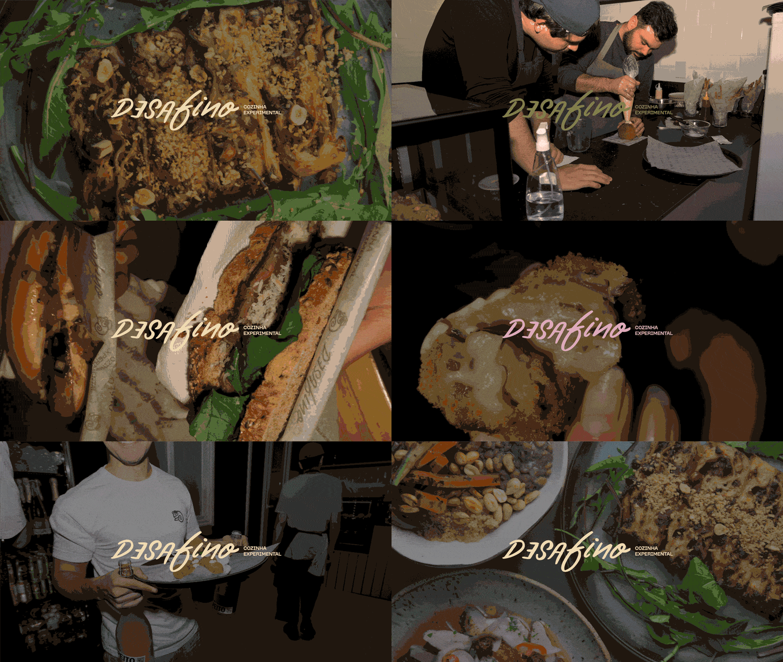
Desafino is a space where experimental gastronomy meets music, culture, and creativity - setting new rhythms for everyday life. The naming was inspired by the idea of cooking in one's own way - even if that means breaking formal rules. The name Desafino (which means "out of tune" in Portuguese) alludes to culinary experimentation, seasoned with the musical atmosphere of Fabrica do Futuro in Porto Alegre, the chosen location for the restaurant. This concept guided both the visual and verbal identity: a blend of flavors mirrored by a mix of tones and notes. The illustrations, with hand-drawn textures and lines, express the tactile and imperfect nature of artisanal cooking. At the same time, they portray moments of togetherness and sharing - the essence of a place that unites food and human connection. The typography reflects the balance between the spontaneous and the structured: hand-drawn letterforms coexist with a clean, modern typeface. The hand-crafted logo embodies the very idea of being "out of tune," with inverted and asymmetric letters. Meanwhile, the symbol - a chameleon - represents a being that adapts, transforms, and explores new territories. In its varied versions, it reflects the diversity of dishes and experiences inspired by different regions and cultures around the world. The color palette combines dark green, graphite, and cream tones, evoking the natural sophistication of the ingredients and the restaurant's warm atmosphere - while accents of yellow and pink add a contemporary touch. This recipe results in a visual identity that celebrates improvisation, transformation and the pleasure of allowing yourself to be out of tune.

Client: Desafino / Graphic Design: Jennifer Costi / Illustration: Jennifer Costi / Verbal Identity: Julia Bertaso / Naming: Julia Bertaso / Project Manager: Helena Verardi / Photography: Jennifer Costi, Enzo Hofman, Lucas Tolio